
Table of Contents
This HEX to RGB guide shows how one colour becomes two spellings. A colour code looks like a secret until you see that HEX, RGB, and CMYK are three notations for the same idea: how much of each primary to mix. The difference that matters is not the notation. It is whether you are mixing light or ink, and whether the colour you chose will still be readable when it becomes text on a background.
In short: HEX and RGB describe the same colour in two spellings: RGB gives three numbers from 0 to 255 for red, green, and blue, and HEX writes those numbers in hexadecimal, two digits each, after #. #FF0000 is RGB(255, 0, 0). RGB is additive light for screens, while CMYK is subtractive ink for print, with a narrower gamut.
HEX and RGB: the same colour, two spellings
RGB describes a colour as three numbers from 0 to 255: red, green, and blue. HEX writes those same three numbers in hexadecimal, two digits each, after a #. So #FFFFFF is RGB(255, 255, 255), white, because all three channels are at full strength. #000000 is black, because all three are at zero. #FF0000 is pure red. An 8-digit HEX adds an alpha channel for opacity: #FF000080 is red at about 50% opacity.
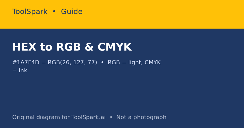
Worked conversion: #1A7F4D. Split it as 1A, 7F, 4D. In decimal, 1A = 26, 7F = 127, 4D = 77. So the colour is RGB(26, 127, 77), a medium green. The reverse is the same process backwards: convert each decimal to two-digit hexadecimal and join them after #. The ToolSpark HEX to RGB and RGB to HEX converters do this instantly, but knowing the split-and-convert method lets you check a result by hand when a colour looks wrong.
RGB versus CMYK: light versus ink
| System | Mixing | Primaries | Used for | Gamut |
|---|---|---|---|---|
| RGB | Additive (light) | Red, Green, Blue | Screens, web, video | Wide, especially bright saturated colours |
| CMYK | Subtractive (ink) | Cyan, Magenta, Yellow, Key (black) | Narrower; some bright screen colours cannot be printed |
That gamut difference is the print surprise: a vivid electric blue or neon green on screen may print as a duller, darker colour, because no combination of CMYK inks can reproduce it. If a design will be printed, convert to CMYK early, proof it, and adjust the design while you still can – not after the print run. Conversely, a design that will only be seen on screen does not need CMYK conversion at all, and converting it unnecessarily can dull colours for no benefit.
Converting CMYK to RGB is not a simple formula with one right answer, because it depends on the colour profile (the specific inks, paper, and printing process). A converter gives a useful approximation for everyday work. For brand-critical print, use the printer’s profile and a proof, not a web converter alone. The ToolSpark CMYK to RGB Converter gives that everyday approximation.
Palettes: harmony, limit, and contrast
A palette generator can suggest harmonies, but harmony alone does not make a usable palette. Four rules help:
- One main colour, one supporting colour, one accent. Three to five colours total is enough for most designs; more colours usually mean less coherence, not more creativity.
- Use harmony as a starting point, not a rule: analogous colours (neighbours on the wheel) feel calm; complementary colours (opposites) feel energetic but can vibrate if both are saturated; triadic colours (three evenly spaced) feel balanced but need one colour to dominate.
- Test the palette in greyscale. If the design still works without colour, its structure is sound. If it collapses, colour was doing work that layout should have done.
- Check contrast for text. A beautiful pale yellow on white may be unreadable. WCAG guidance uses contrast ratios: 4.5:1 for normal text is the widely used AA target. Check your text/background pairs with a contrast checker, not by eye alone, because screens and eyes vary.
A workflow for a real project
- Pick the main colour from the brand, photograph, or mood you need – not from a random generator alone.
- Generate two or three harmonies around it with the ToolSpark Color Palette Generator, and pick the one that fits the mood, not the one that looks most colourful in isolation.
- Convert the chosen colours to the formats you need: HEX for web code, RGB for design tools that prefer it, CMYK for print.
- Test the palette on real content: headings, body text, buttons, and a photograph, not just colour swatches.
- Save the palette with names and values (for example, Primary #1A7F4D, Accent #E8B84B), so the next person to use it does not have to guess which swatch was which.
Colour codes are not magic. They are measurements of light and ink, and once you can convert between them and test for contrast, the guesswork disappears – which is the point of having a converter in the first place. For picking a colour by eye, use the ToolSpark Online Color Picker.
Frequently Asked Questions
What is the difference between HEX and RGB?
None, in value: HEX is RGB written in hexadecimal. #FF0000 is RGB(255, 0, 0). They describe the same colour; HEX is just shorter to write in code.
How do I convert HEX to RGB?
Split the six HEX digits into three pairs, one for red, green, and blue, and convert each pair from hexadecimal to decimal. #1A7F4D becomes R=26, G=127, B=77.
Why do print colours look different from screen colours?
Screens emit light (RGB, additive). Print uses ink (CMYK, subtractive), which cannot reproduce every screen colour. A bright screen colour may print duller, which is why print work should be checked in CMYK before printing.
What is CMYK?
Cyan, Magenta, Yellow, and Key (black): the four inks used in most colour printing. CMYK values are percentages of each ink.
How do I pick a palette that works?
Start with one main colour, add colours by harmony (analogous, complementary, or triadic), limit the palette to three to five colours, and check contrast for text, not just beauty.




Community Reviews & Discussion
Be the first in the community to share a tip, workflow suggestion, or review for this tool!